How to apply our brand colours to meet accessibility guidelines.
Why does colour contrast matter?
Digital accessibility is all about removing barriers. One of the most critical aspects is colour contrast: the difference in brightness between text and its background. Insufficient contrast can make text difficult or even impossible to read, especially for people with visual impairments.
By ensuring adequate contrast, we make our content more readable and user-friendly for everyone. The university follows the internationally recognised Web Content Accessibility Guidelines (WCAG) to achieve this.
Our colour palette: designed for accessibility
The colours within the university's brand identity have been tested for accessibility. When you use the predefined colour combinations, your design will automatically meet the required contrast standards.
Our palette is structured with primary colours and secondary colours. The rules for their application are simple and guarantee proper contrast.
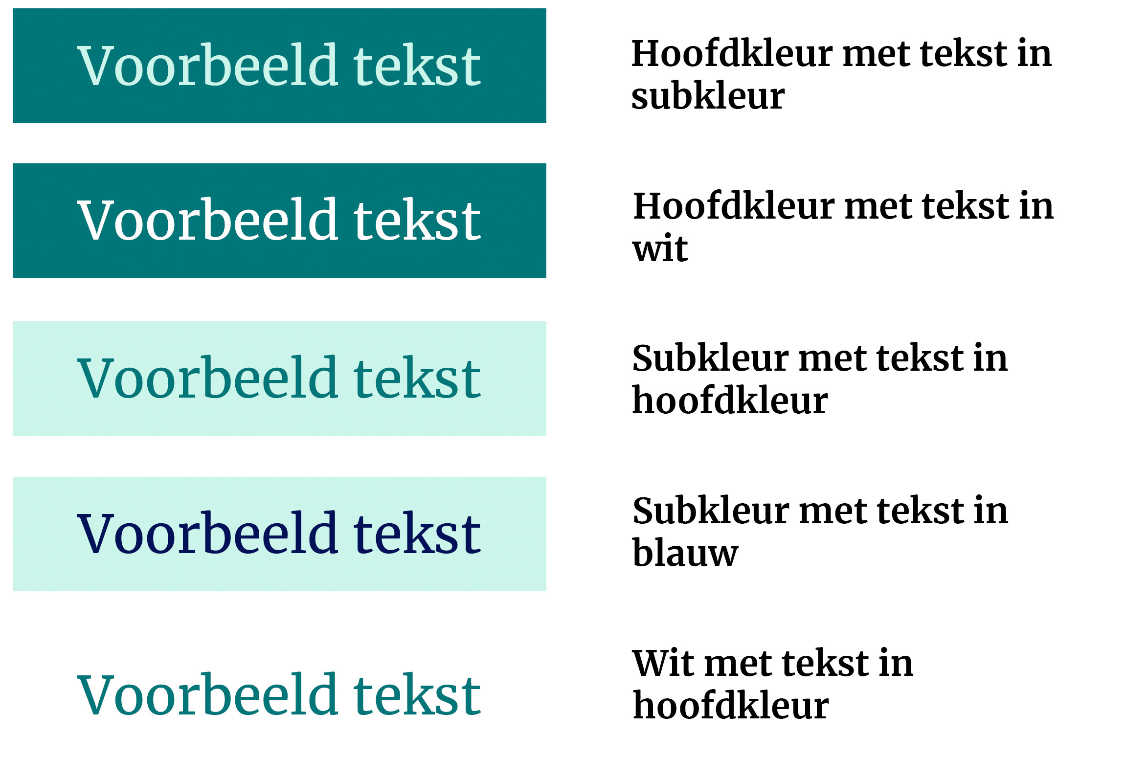
Rules for using colours:
Primary colours
These colours are intended for use as text colours or for graphic elements. Always use a primary colour on a light background, such as white or one of our secondary colours.
Secondary colours
These colours are intended for use as background colours. Always use a secondary colour in combination with a primary colour or University Blue as the text colour.
Always use light-coloured text on a primary colour background – never dark blue or black. Conversely, always use dark-coloured text on a secondary colour background – never white.
Guidelines for using accessible colours
When creating presentations, documents, web pages or social media posts, keep the following in mind:
- Stick to the approved combinations, as specified in the brand portal. This is the surest way to guarantee a good contrast.
- Use colour to support rather than convey information. Don't just colour-code important words; make them bold as well.
- Don't create new colour combinations. There is a high risk that these will not meet the required contrast ratio.