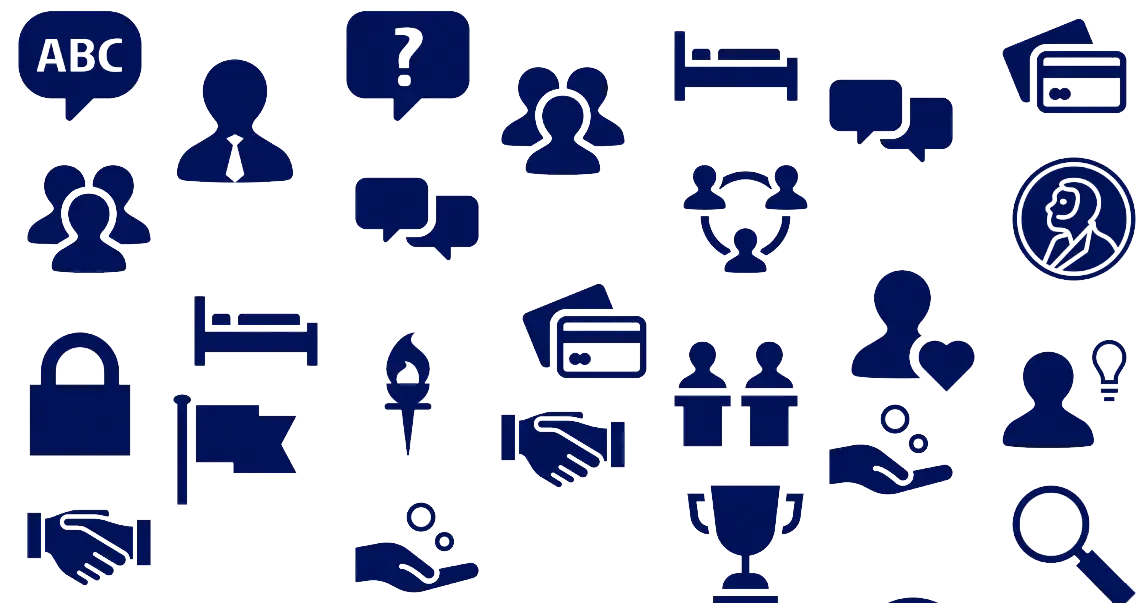
You can download our icons on this page. These are a simple and friendly way to draw attention to complex information. Icons reinforce your message, enhance recognition and create a consistent visual language throughout our communications.
Use the icons according to the colour scheme.

How to use icons
- Be consistent: Only use the university's official icon set. This uses our house style and creates a recognisable visual language.
- Use to convey meaning: Choose icons that support or explain content. Avoid using them for decoration.
- Combine with text: Icons support but do not replace text. Always provide supporting words or labels to prevent misinterpretation.
- Consider format and legibility: Make sure that icons have sufficient contrast and are clearly visible on all screen sizes.
- Respect white space: Give icons breathing space. Don't place them too close to text or other elements.
- Use a contrasting background: Ensure sufficient contrast between the icon and the background. Stick to the Leiden University colour scheme. Never place an icon over a photo.
Avoid
- Altering the icons: Do not change the colour, proportions or style of the icons. This affects recognition and quality.
- Using the icons excessively: Use the icons sparingly and only where necessary. Too many icons can be confusing.
- Ambiguity: Only use icons that are clear and universally recognisable to the target audience.
- Using your own icons: Do not use icons from external sources or custom-made pictograms. This disrupts the visual harmony of our communication.
If you cannot find the icons you need, let us know and we'll try to add them each time we update this website.
At present, the icons can be downloaded as PNG. You will soon be able to download them as SVG too.