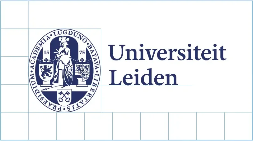
The Leiden University logo consists of two elements, which must not be used separately:
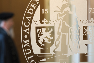
- The logomark: the seal with Minerva
- The wordmark: the name 'Universiteit Leiden'
The logo is the most important visual element of our visual identity and symbolises our history, which dates back to 1575.
Below you will find some variations and exceptions.
About our logo
Guidelines
White space
Make sure there is enough space around the logo to ensure it remains clearly visible. This should be equal to 1/3 of the seal's height on all sides.
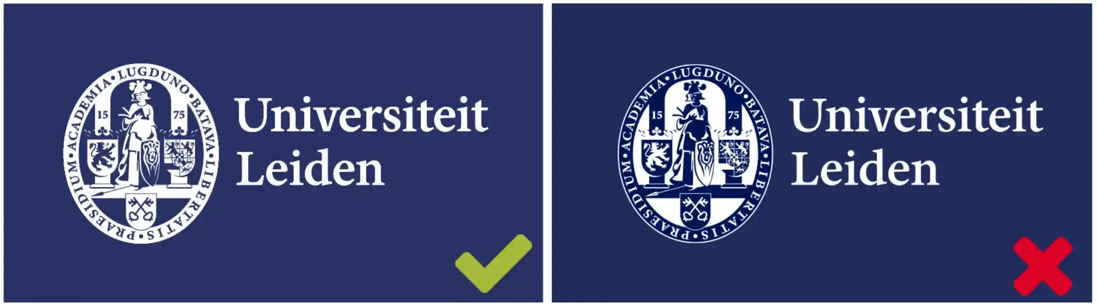
Background colour
Always use the logo on a blue or white background. If you want to use it on a background that is not blue or white, such as a photograph or a background in a faculty colour, use the 'droplet' version instead.
Reversed logo
Use the reversed logo on blue backgrounds. The seal remains unchanged; only the wordmark changes colour.
Note: When using the logo on a dark background, check that you are using it correctly: Minerva must always be white.
File formats
The logo is available in various file formats. The vector version is typically used for print, while the bitmap is used for digital applications such as web pages.
Vectors and bitmaps
Different versions
Faculty logos
Faculty versions of the logo are available that include the faculty name.
Versions for other organisational units will be added to the Brand Portal.
'The Netherlands' logo
If you are communicating in English and it is not clear from the context that Leiden University is a Dutch university, you can use the international logo with The Netherlands added.
Please note: Universiteit Leiden is an integral part of our logo and must not be changed to Leiden University.
Exceptions
- A vertical version of the logo is available for use in spaces too small for the standard horizontal version.
- A version with an enlarged wordmark is available for use on buildings.
- A single-colour (white) version of the logo is available for use on solid-coloured surfaces (e.g., a bag, sweater or pen).